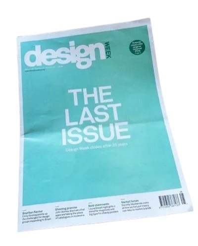
99 ‘Design Week’ magazine columns.
It was 13 years ago, but I remember it well. I’d just stepped off the plane from Amsterdam and I turned my phone back on. And there was a message from my good friend Lynda Relph-Knight, editor of Design Week. It said that she wouldn’t need copy for my ‘Private View’ column, because the magazine had closed.
It felt like a punch in the stomach. So God only knows what Lynda was going through. She’d been at the helm of the UK’s first design business weekly for 20 eventful years. Witnessed and reported seismic changes in an industry finding its feet. Weekly publications are toughest of all. So hats off. And having been through the trauma of three magazine closures myself, I felt for Lynda and her team.
The redundant Private View column would have been by 99th effort. And I’d already been mulling it over in my head. So I wrote it anyway. Here it is …
>>
In his latest Design Week Private View, Jim K Davies considers his relationship with Amsterdam, and how this squares with the Dutch perspective on design.
I’m always threatening to spend time in some of the great European cities — Florence, Barcelona, Berlin, Vienna. But somehow, when it comes round to it, | end up back in Amsterdam.
I’ve never actually lived in Holland, but because I’m half Dutch, I’ve visited the country virtually every year since I was born. The canals and bikes, the cobbled streets and low skyline, the cadence of the language, are both familiar and exhilarating. And of course I drool over the vernacular graphics, the street posters, local packaging and shop signage. Around every corner there’s déja vu, I hear echoes of my childhood, remember my mother, feel a real or imagined connection with my forbears. Even in doing the most mundane things, I have an almost spiritual experience.
To me, that’s something deeper and more precious than traipsing round the most wonderful cathedral or art gallery in one of the more rarefied European capitals. And because I now know the place reasonably well, I’ve moved beyond the obvious — the Museumplein, canal boat cruises, Anne Frank etc — and have started to explore the next layer down, revelling in the quirkiness of the place, embracing its peccadillos and peculiarities, coming to understand why it is what it is.
It struck me that my evolving relationship with Amsterdam has similarities to the way the Dutch view and explain design. Design is such a nebulous term, it can mean virtually anything we want it to. The word can be used in relation to a CD cover or an Airbus, a city signage system or a chair. Ask a hundred people to define it, and you’ll dredge up a hundred and one different answers. The extra one being from the person who couldn’t quite make his mind up.
For most non-practitioners however, design implies a surface sheen or prettification — anything from the cod-Georgian flounce Lawrence Llewelyn Bowen might dream up for one of those tiresome home décor TV shows, to the garish colourways on the latest pair of Nikes.
In Holland — perhaps to counteract this one-dimensional response — they have settled on two words for design (three if you include the English word, which is also in common usage.) The first is vormgeving, which literally means ‘to give form’, and refers to the more aesthetic side of design — making things pleasing to the eye and desirable. The other is ontwerpe, which is more about function and making things work properly — the less glamorous but essential nuts-and-bolts aspect of design.
It’s not exactly form and function, but not far off. Dutch designers who want to be taken seriously (and most do) tend to align themselves with the ontwerpe camp, even if they’re involved in primarily visual disciplines like graphics or packaging. Vormgeving tends to be looked down upon as vapid and superficial — a distantly related dumb blond/e no one wants to be associated with.
This attitude is culturally typical. From the outside, the Dutch may appear to be laid back and easy going. But actually, they are quite angst-ridden and deep. They agonise over the smallest details and take themselves surprisingly seriously. Unlike the British, who tend to skirt around difficult issues like Darcy and Elizabeth Bennett at a formal dance, the Dutch are far more direct and always prepared to ask frank, probing questions. Which is probably why the more down-to-earth ontwerpe has so much more kudos than the flaky vormgeving in Holland.
As for me, I sheepishly admit to liking a bit of both … I’m only half Dutch after all.
