a daily dose of type.
I must admit, I’ve been sorely tempted by a MassimoVignelli Stendig calendar for some time. Designed in 1966, it’s still the most brutally beautiful thing imaginable. You can just picture it hanging artfully on the exposed brickwork of a Shoreditch warehouse studio. But at 3 by 4 feet, you need some serious wall real estate to accommodate it. And I can’t help thinking this huge expanse of paper is less than eco friendly, even though the makers playfully suggest you use the discarded months as wrapping paper.

Above: Stendig alone: Massimo by name, massive by nature
The alternative is the slightly more adventurous Pentagram calendar (though it’s actually designed by alumnus Kit Hinrichs). This keeps the same format, but rings the typographic changes each year, and will feature examples of vernacular type for 2012. It comes in two sizes, so it’s more manageable, but you can’t get hold of it in the UK, and shipping charges from the US are astronomical.
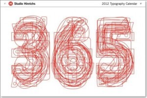
Above: Let’s year it for Pentagram’s moveable typographic feast
For these reasons, I’ve plumped for the book-like Typodarium calendar (available on Amazon for £14.76) this year. You can keep it plonked horizontally on your desk or hang it up vertically. I’m not sure how useful it will be as a calendar, but it features a different typeface for each day of the year, along with information on the back. And you can keep the torn off pages in a handy box to peruse at your leisure. As you can probably tell, there’s ever a dull moment around here.
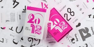
Above: Every day’s a bit different with Typodarium