a different take for the BFI.
The brief came in through regular collaborators Spy Studio. It was to get people back to the BFI after lockdown restrictions and a renovation programme had been completed. An awareness campaign to remind them what makes the BFI experience different, richer, more absorbing than going to your local multiplex.
Because of copyright issues and the fact that we weren’t touting particular films or season, using movie imagery was out. Working over Zoom calls and Miro boards with the BFI brand team, Spy explored various illustration routes and ways of visually representing the BFI experience, in an intriguing, but generic way.
But even this felt too narrow and indicative. Eventually it was decided that the copy should do the heavy lifting, supported by a suitably arresting typographic treatment. And we tried all sorts … long form, short form, poetry, mini stories, character points of views, headlines, rhymes, puns, wordplay, and plenty more.
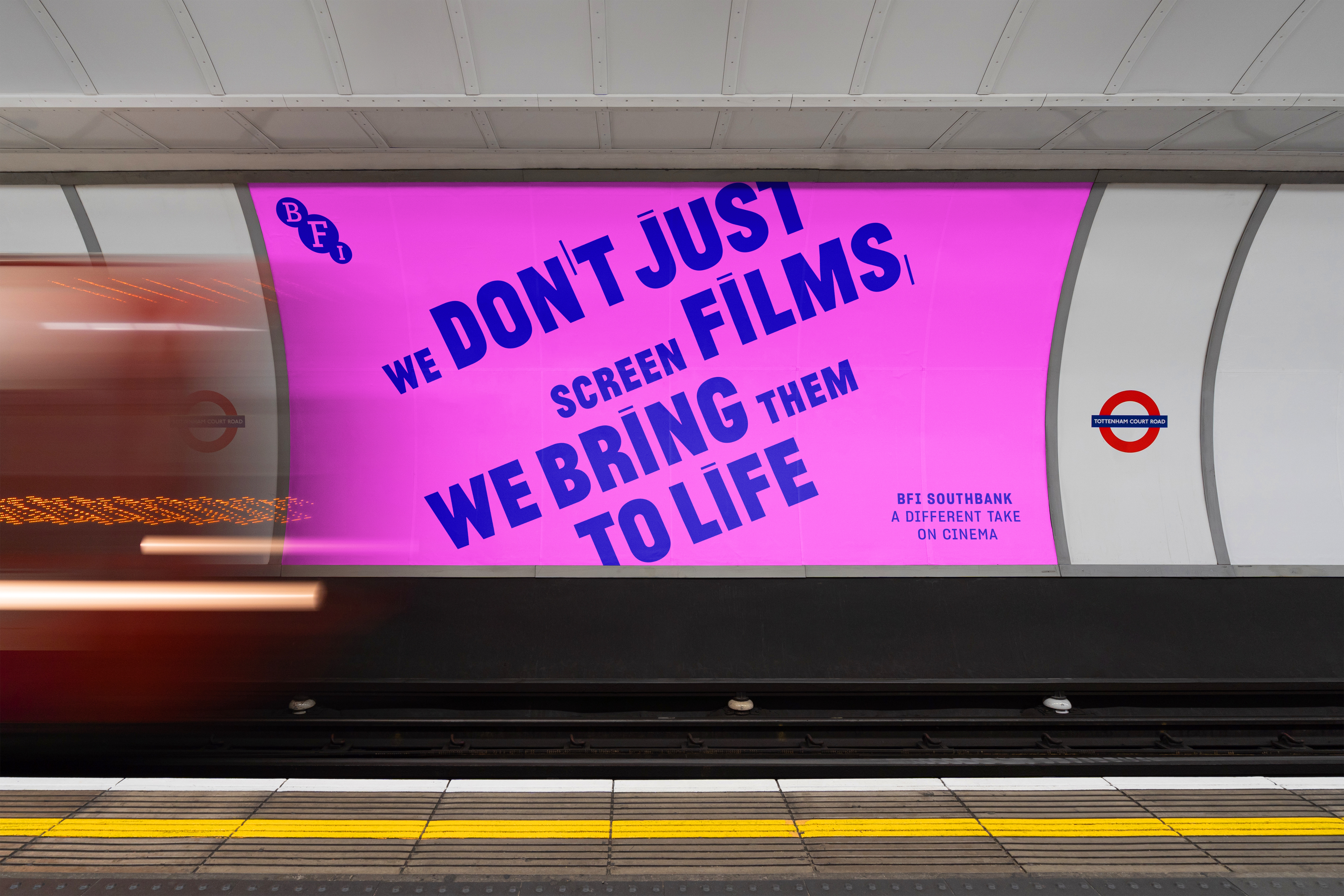
And out of all this, it was one line that struck a chord with the client — ‘a different take’. So we built a whole campaign around this idea, creating a series of witty ‘make-you-think-a-bit’ poster headlines and using ‘a different take on cinema’ as the unifying sign-off line.

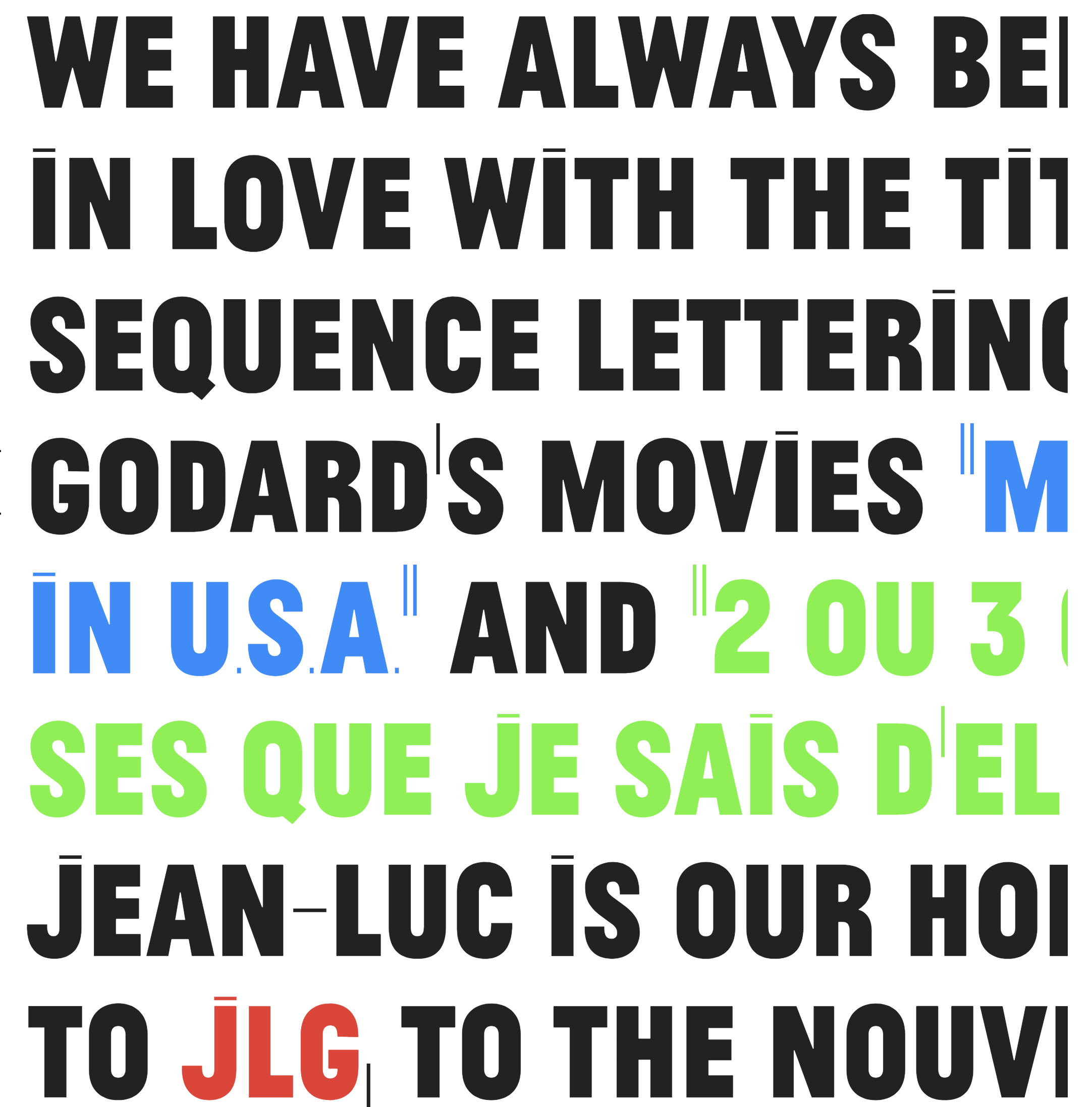
Spy went big and bold with the type and colours, using a distinctive and suitably filmic font called Jean-Luc. This is a homage to the typography used in nouvelle vague Godard movies by the Portuguese design studio Atelier Carvalho Bernau. And, to add a further dimension, the lines were artfully brought to life in animation by Brendan Bennett of BREZ.
The ‘different take’ campaign appeared as static and animated posters in-house at the BFI, as well as on the Underground and various poster sites around London.