Bowie, Barnbrook and fingerless gloves on the pulse.
I held off from listening to the new David Bowie single for as long as I could. I wanted the media noise to die down and to make up my own mind. But I was also worried about being disappointed. Like the retired boxer’s ill-judged comeback, or the faded matinee idol who can’t resist another movie, there was a distinct possibility that Bowie had lost it, or was finally a man out of time. The longer I kept away from ‘Where Are We Now?’, the longer Bowie’s spell would remain intact.
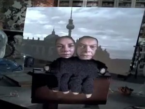
Above: Digitised... Bowie and friend reminisce about the old Berlin days.
But when I finally took the plunge, I was relieved. The song itself had a haunting, elegiac quality, an evocation of lost love and lost times. Where once Bowie cut up random phrases to create an overblown world of sci-fi fantasy and psychodrama, here we had low-key fragments of memory — faraway places and faraway people, faded and muffled. The man’s many masks had been removed at last… he was seemingly speaking from the heart rather than through some artfully constructed character. All rather beautiful and touching.The promo video, by US director Tony Oursler, was also intriguing. Nothing slick, nothing flashy, nothing rock ’n’ roll. Two faces tightly and crudely cut out, with a knitted fingerless glove for a body, sitting on a table strewn with mementos. On the right Bowie singing, on the left an an anonymous woman looking out passively. A mirror behind them screens grainy black-and-white footage of 1970s Berlin. The lyrics are tapped out in a gnarly typewriter font as they’re sung; clearly, we’re meant to take in the words. This is more art school than MTV — raw, home made, curious, slightly ugly and unnerving. Eschewing his trademark showmanship, Bowie speaks in a whisper, but we still listen.

Above: Next... don’t mention dolphins swimming.
Which brings me on to Jonathan Barnbrook’s cover design for Bowie’s forthcoming album, ‘The Next Day’. Lambasted for being “lazy” and “ugly”, its vociferous online critics have missed the point entirely. In fact, this is a spectacular coup, a masterful piece of anti-design that has sparked astonishing debate and controversy two months ahead of the album’s release.Barnbrook has simply taken the cover of Bowie’s 1977 album “Heroes”, and placed a white square in its centre. The new album title sits in this square, set in a new Barnbrook-designed sans font called Doctrine. Meanwhile, the word “Heroes” on the original image behind has been struck out.The design is by no means a thing of beauty, but there’s no denying it’s bold, brave and original. As a simple visual metaphor, it speaks eloquently of moving on, while never quite being able to escape the past. There’s something almost sacrilegious about defacing a classic LP design, an echo of Barnbrook’s design for Bowie’s 2002 album ‘Heathen’, which featured vandalised works of art. However, the graphic defilement of ‘The Next Day’ has a more casual brutality — a rudimentary address sticker slapped over a seminal piece of rock iconography. The Doctrine font too is a deliberate piece of undesign, far less showy or politically charged than most Barnbrook typefaces, so it doesn’t distract from the central idea.Of all Bowie’s album covers, the choice of “Heroes” as a backdrop was inspired — the second in the so-called Berlin trilogy, with a striking black-and-white portrait by Masayoshi Sukita, this was Bowie pictured at the height of his creative powers. “We could be heroes, just for one day”... but now, slaves to the inevitability of time, we’ve moved on to the next.Here’s how Jonathan explains his rationale.And here’s a rather amusing (if wide-of-the mark) spoof page which shows that his design has already passed into graphic vernacular.