D&AD writing for design judging – the post mortem.
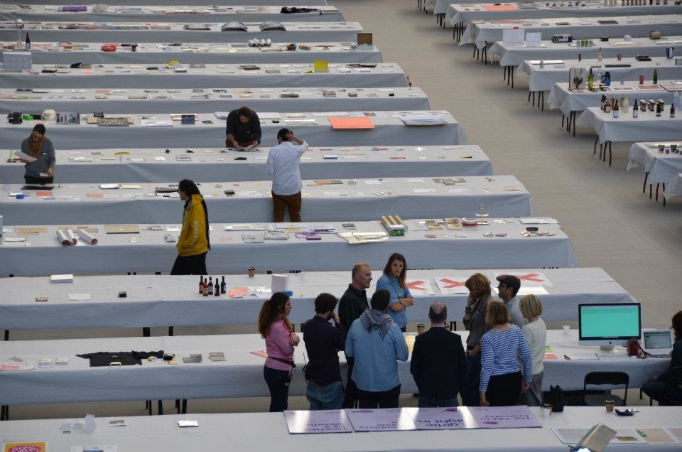
It almost goes without saying that being foreman of this year’s D&AD Writing for Design jury was the next best thing to shaking Johan Cruyff’s hand. As you walked into the vaulted expanse of Olympia, with the sun shining through the latticed ceiling, it felt like you were in some kind of creative heaven — only without the blessed harps and angels. There was table after groaning table of the best work in the world, stretching off into the horizon, a seemingly endless feast of ideas and perspiration.
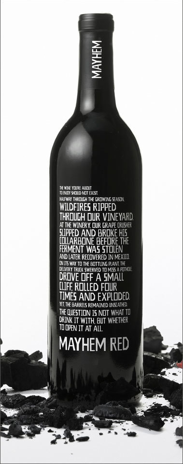
On our six tables, there were 70-odd entries including books, bottles, posters, mailers, annual reports, leaflets, cards, websites, three bikinis and a pair of vibrators. My fellow jurors (Nick Asbury, Fiona Thompson, Chris Doyle, Lisa Desforges, John Weich and Anelia Varela) were as keen as I was to get stuck in, to be inspired and informed, amused and amazed. But it soon became apparent that, although the overall standard was well above middling, there was very little to make the soul rejoice and the heart sing. Yes, there was plenty of perfectly accomplished, lively, well-crafted writing, but very little with the glimmer of greatness required for the pages of the hallowed D&AD Annual.Standing next to Nick and Chris, of course you’re hoping for the next ‘Corpoetics’ or ‘Christopher Doyle Identity Guidelines’. But unfortunately any pretenders to the crown hadn’t made it past security. The design on offer was pretty lukewarm too… but then you only had to wander over to the Packaging Design or Typography tables to witness the verbal and the visual jostling for podium position. For example, a wine bottle called Mayhem Red, presented in horrifically charred packaging, stood out. Set in cleverly weighted white type that emphasised chosen phrases, the sharp copy was printed directly on to a black bottle:
If it had been entered into Writing for Design, who knows, Leo Burnett Chicago might have had another nom on their hands. Naturally enough, us judges had a leaning towards the more witty pieces. Who doesn’t like to be amused, after all? But almost inevitably, most of this type of work is self-initiated, or at least for small creative clients (photographers, retouchers, printers etc), who have given writer and designer licence to create something fabulous. Should we subtract points for this inherent advantage over client work, or simply judge it on face value? Even so, striking the right balance and avoiding over-indulgence is easier said than done. There’s been a definite backlash against the jaunty, backslapping Innocent-esque schtick, a tone that was cutely parodied here in a range of Zing food sauces.A website for Various Artists, one of only five pieces to make it into the book, managed to hit the right note. A relatively new creative agency, they made a virtue out of the fact that they had little work to show, putting together a simple colour-changing home page cleverly based around the words ‘this’ and ‘that’. You click through ‘this’ or ‘that’ through to a series of surreal You Tube clips that make the point. Snappily written, in a slightly knowing, conversational tone, we liked its fresh unpretentiousness. And it was good to recognise a piece of digital writing in this category, which is traditionally dominated by print.Nick Asbury’s work for Little Chef through Venture Three deserves special credit too, a really strong piece of client-vetted, commercial writing that had to appeal to the ‘man on the road’. Fun without trying too hard, it showed a real grasp of craft and judgement.Although there were some ‘serious’ candidates, notably an eco-awareness book called ‘The Great Indian Clearance Sale’, and the BP annual report written by Tim Rich (arguably the most scrutinised piece of corporate writing this year), we felt they were let down by the design. The former for being too random and obtuse, the latter for being too unremarkable.
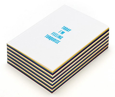
The piece that really stood out though was ‘Today I’m Feeling Turquoise’, by Domenic Lippa and his team at Pentagram London (with writing by Naresh Ramchandani and Tom Edmonds). Towards the end of the judging, we all stood round and read segments to each other, it’s that good. It’s a ‘seasonal gift’ which ponders the meaning of colours/colour theory, in a really deft, humorous way. The booklet is made up of double-page spreads of coloured paper sealed with a perforated edge. The reader selects a colour and tears open the perforations to reveal the mood it represents. And of course you want to read them all. The writing and graphics complement each other beautifully, it has a really easy flow, the timing and gags are exemplary, it’s lively and imaginative, witty and rather wonderful. I’m the colour green at the moment.Anniversaries are predictable enough, but inspiration is not. It’s a real shame D&AD’s 50th wasn’t a vintage year for Writing for Design. I’d have loved some gems to have been unearthed on my watch. But on the other hand, I feel that five ‘in books’ and a single nomination was a fair reflection of the work set out before us. And I honestly don’t think we made any gross omissions. Particularly when you think that the Blackpool Comedy Carpet, one of the most outstanding pieces of graphic design in a decade, didn’t even make it into the D&AD Annual.For more on the five in-books, visit Fiona’s blog.For more on the judging process, visit Nick’s blog.For wider reflections on D&AD visit John’s blog.


