Derek Birdsall RDI, 1934–2024
I’ll never forget the time I spent with Derek Birdsall, titan of British editorial design, who sadly passed away in June 2024 aged 90. Beneath the gruff exterior I found him to be a warm, generous, opinionated and exceptionally talented man full of stories and bonhomie. I will remember him fondly.
A bit of background. In 2004, writers’ collective 26 and the Typographic Circle staged an exhibition of posters based on the alphabet at the British Library. Titled ‘26 Letters: Illuminating the Alphabet’, it was part of that year’s London Design Festival. Twenty-six designers and 26 writers were randomly paired and asked to design a poster based on a given letter. I was fortunate enough to land Derek and i.
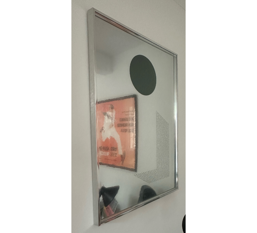
We produced just two copies of the poster as the reflective surface it was printed on was expensive. As I recall, they cost £120 each. At first Derek said I should pay for my own, which I was more than happy to do. But when we’d finished, he insisted it should be his gift. It hangs on my wall to this day. As you'll see, I’ve attempted to take a photograph, but that’s more or less impossible without including half the room.
The diary piece below paints a picture of our first meeting and working process. It was originally published in a book that accompanied the exhibition. If you click on the first image below, you can read the copy.
---
For me, being paired with Derek Birdsall was a bit like finding out you’re on the same team sheet as George Best. Not that Derek’s one for mazy dribbles from the half way line, you understand. Just that his work and reputation blazed before him, and I felt very much the fan and junior partner.
But he was a little elusive at first. My various introductory emails appeared to have disappeared into a black hole hovering somewhere above north London. So, for the moment at least, I made do with his new book, Notes on Book Design. It was so personal and personable, that by the time we finally hooked up, I felt I already knew him reasonably well.
It turns out that Derek is not much of a one for email. Or mobile phones. Or any new-fangled technology really. But he eventually phoned me, and we arranged to meet at his alma mater, Central School of Art in Holborn. It was the last week of his show there featuring (incredibly) 50 years of his graphic design work, and he promised to buy me lunch afterwards.
I arrived on the dot, ready to vie for prime position with the hoardes of young graphistos picking up tips from the great master. But when I got there, the place was curiously empty. Still, at least I could breathe out and enjoy the exhibition in peace. Take in everything from the sacred (Common Worship prayer book) to the profane (the Pirelli calendar from 1968).
Finally Derek bustled in, bearded and slightly bohemian, apologising for his tardiness. He quickly went on to recount an anecdote about sleeping in the subway nearby the night before his interview at Central almost half a century earlier. He’d travelled all the way down from Yorkshire, and there’d been a mix up at the hostel nearby where he’d booked a bed for the night. He didn’t know London at all, and was determined to stay as close to the college as possible. “God knows what I looked like when I turned up next morning,” he said.
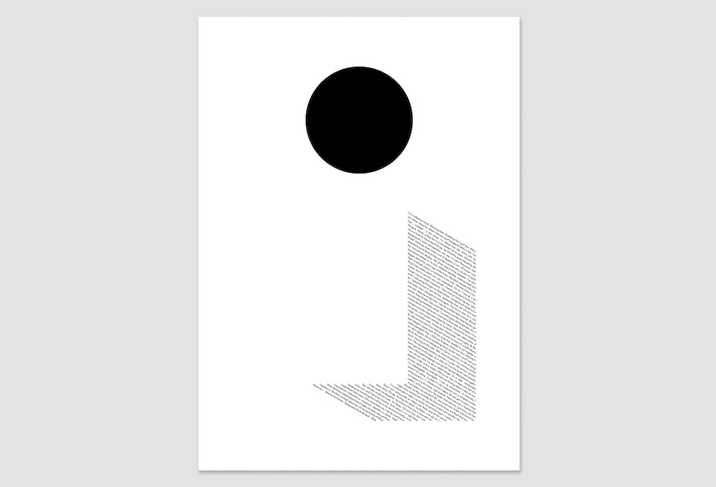
Soon we’d made our way across the road (and over the subway) to Spaghetti House, where the waiters greeted Derek like a long-lost friend. I figured he might have been there before. A good project, he assured me, invariably started with a good lunch. A medium-rare steak and several glasses of wine later, we exchanged ideas. Mine consisted of several doodles in a Simpsons exercise book. I felt the graphic simplicity of the capital letter I might be a way of creating a dramatic mark on a poster. I imagined a simple great slab of black on a white background, like a Rothko painting. Or a sheet made up of thousands of small strokes, like so many ants crawling across the surface. Or perhaps set at an angle to look like rain.
Curiously, Derek’s solution was far more words based. He had a piece of paper folded in half with a round hole cut out of one side. You could see some text through the hole, and when you opened the paper, it revealed a dictionary definition of I, set in a neat column. The hole had now become the dot (or ‘tittle’, as I later learned it was called).
We kept drinking and talking about I, and suddenly it seemed obvious that we should print the design on a reflective surface. That way, the viewers would be looking at themselves as they looked at the poster. It seemed to encapsulate the narcissism of the letter, but also question the relationship of the viewer to the piece. Who’s looking at who? Just who is I? Once we’d settled on this route, it seemed to be working on many different levels and open up many different possibilities. And Derek was adamant that he still wanted a hole for his tittle.
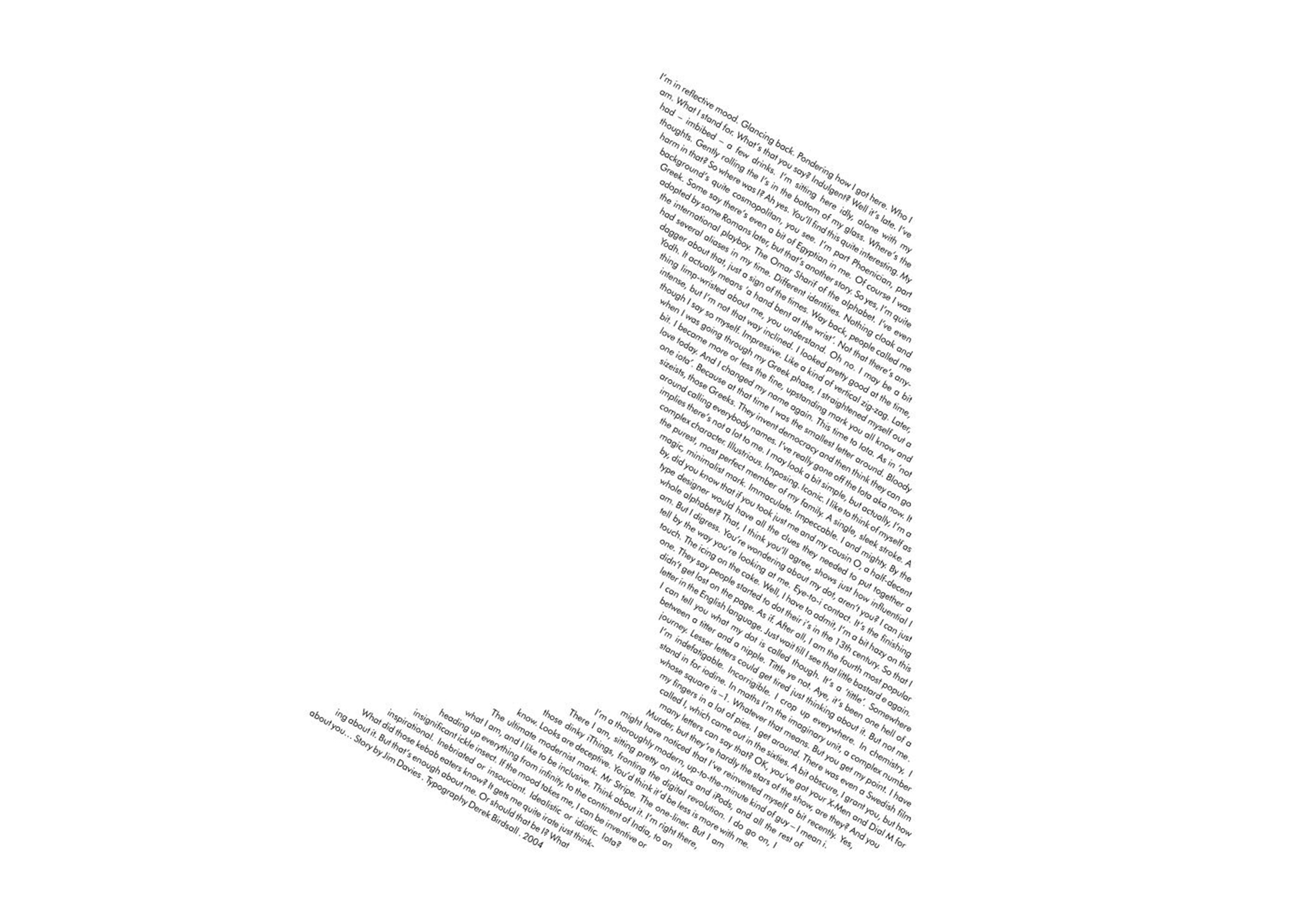
My part of the bargain was to go away and write a short story, which Derek would then set to look like a giant I. I took nearly all my cues from the gift of a letter we’d been allocated. Clearly, it had to be written in the first person. It had to start with an I. And there had to be as many puns and outlandish words beginning with I in it as possible. It was a chance to portray an egocentric, self-obsessed character. Someone who loved bigging himself up. The big I am.
Derek, as I discovered over lunch, is a great raconteur, and I wanted to reflect this by having I tell an amusing, slightly rambling, anecdote. So it became the story of how the letter I had developed from ancient times, told in character. I also decided to make some oblique references to reflections and point of view along the way.
I sent it to Derek, and waited. And waited. Oh my God, he hates it. And he doesn’t know how to tell me.
On the third day he phoned. “It’s great,” he said. “Perfect.”
Derek made one further refinement. He set the words as the shadow of an I rather than the I itself, adding yet another layer to the piece. The form of the I becomes a piece of negative space, the words seemingly cast by it. Yet more questions about identity and the reliability of the narrator are raised.
The partnership worked well. We both gave each other the respect and space to do what we do best. The words and image seemed to gel together organically. When I asked Derek if he wanted to write half of this diary piece he declined politely. He said one person should do it, otherwise we’d end up sounding like Tweedle Dee and Tweedle Dum. Quite right. After all, I am I, and so is he.
Jim K Davies, July 2004
This diary piece was originally published in ‘26 Letters; Illuminating the Alphabet’ (Cyan, 2004).