Empress — from a few words to a visual language.
Our work on Empress Litho with Supple Studio shows the creative symbiosis of copywriter and designer flowing in a less than usual direction.
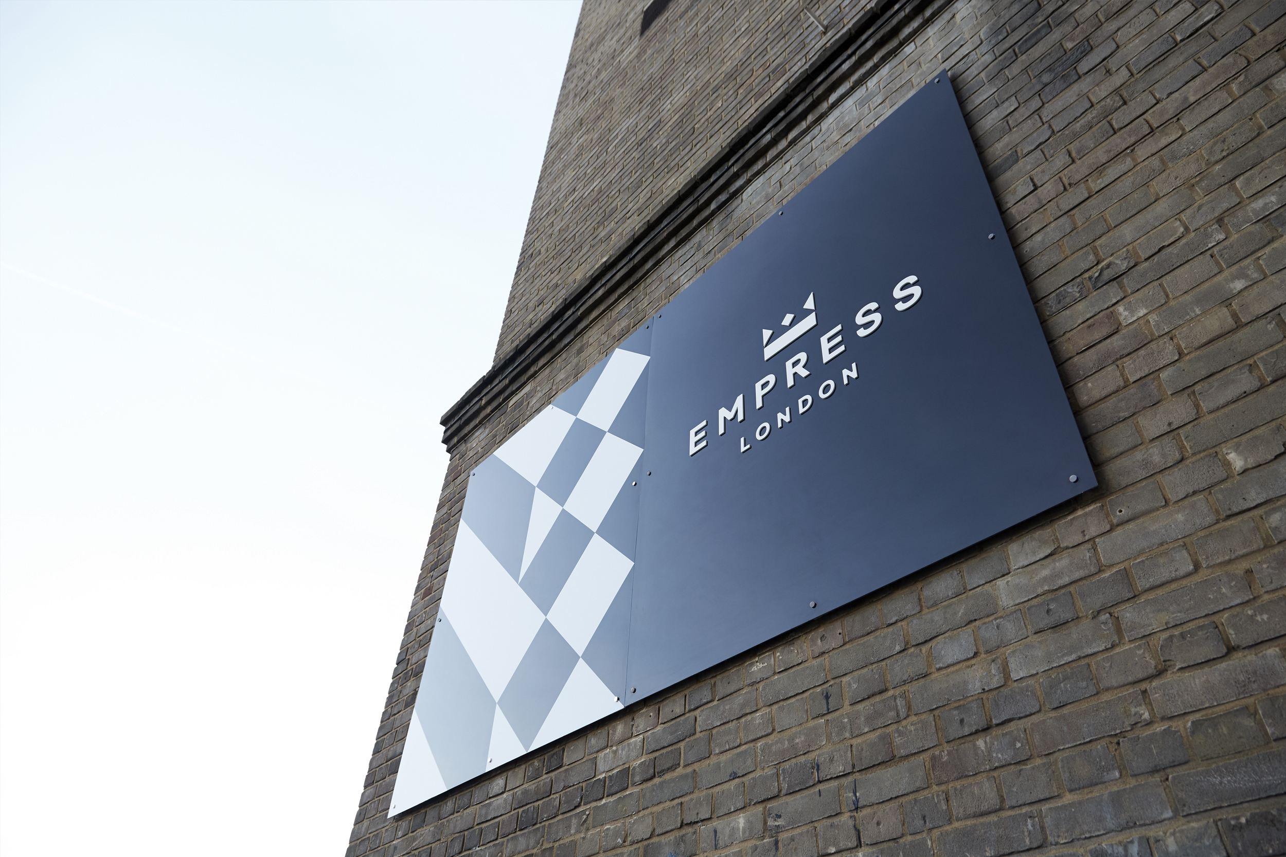
At the very start of the project, we were asked to come up with a selection of straplines for the highly regarded printer, which is based in an ex-royal naval store in Woolwich Dockyard and a firm favourite among discerning design studios. Thirty years old and with a bulging awards cabinet, Empress is one of the few remaining lithography printers in the capital and known for its high-end repro and immaculate finishing.
Straplines are a proven, time-efficient way of oiling the creative cogs. Bending and flexing a few words within tight parameters, playing round with puns, alliteration and tweaked idioms can set ideas in motion and open up thematic avenues that are worthy of further exploration.
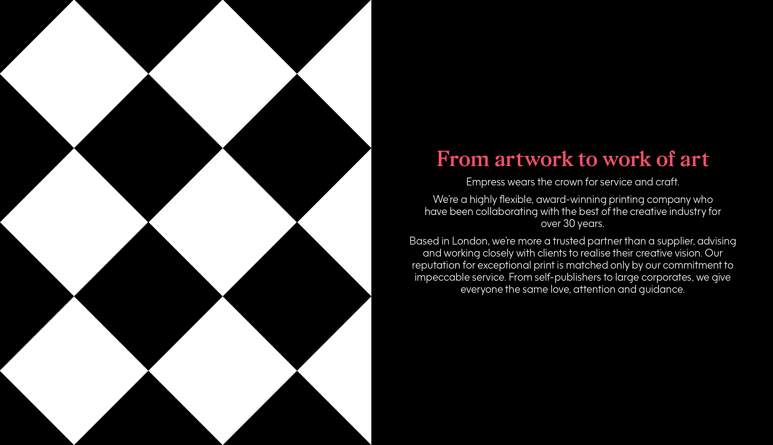
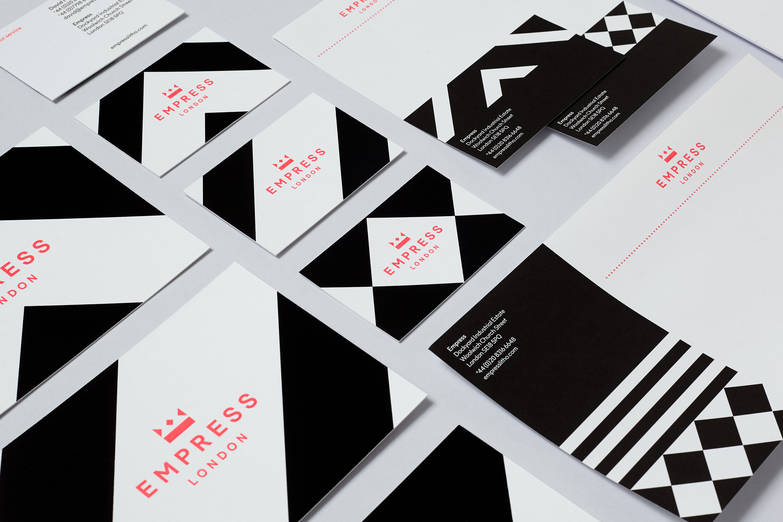
We came up with 30 of them. Some better than others. Second on the list was ‘London’s print royalty’, a simple play on the name Empress (itself a play on the word ‘impress’). This was enough to spark Supple’s Jamie Ellul to conceive the idea of a crown and E monogram. Which, in turn, led to the thought of taking heraldic patterns and giving them a super graphic and modern twist.
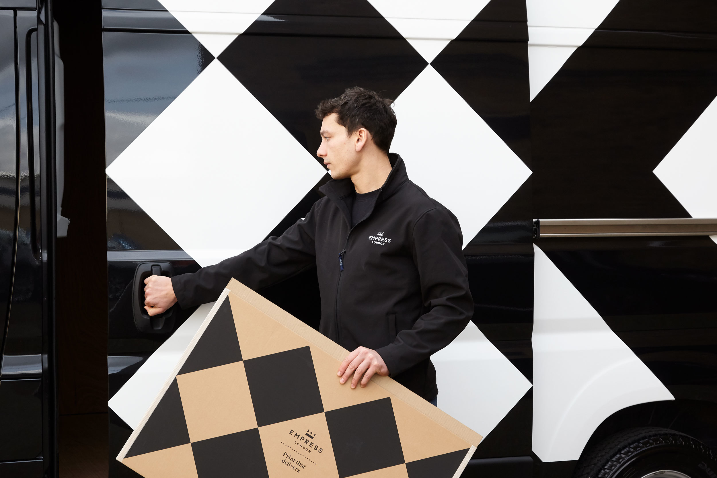
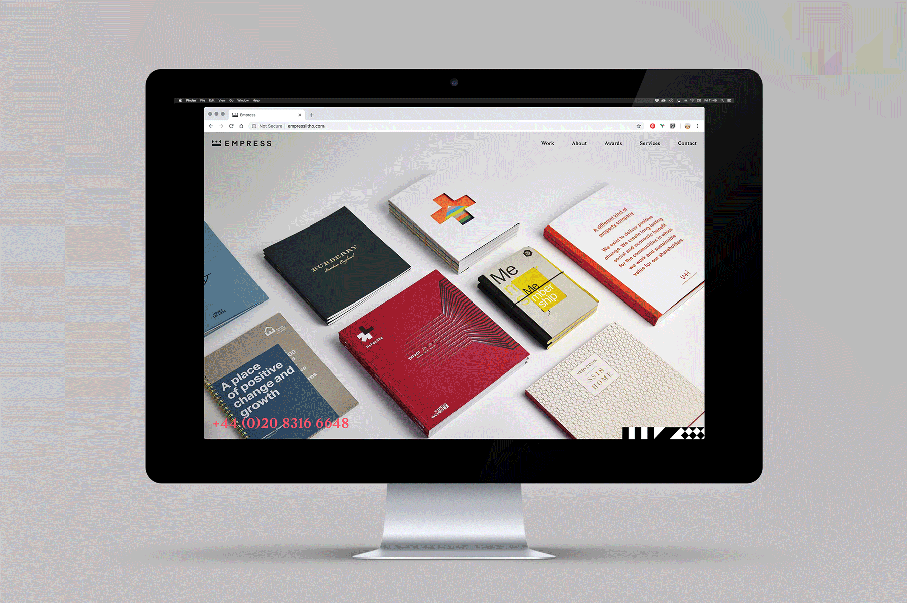
The strapline wasn’t actually used in the end. But by then it had made an invaluable contribution, as the genesis for one of the strongest visual identities we’ve worked on in years. We went on to write Empress’s positioning statements and website, playing our part in a more accustomed manner.
There’s a great interview with Jamie on the Communication Arts website, explaining his ideas and process.
And a lovely animation by Supple designer Katie Cadwallader showing the Empress identity in motion.
