is it another bird? Is it another plane?
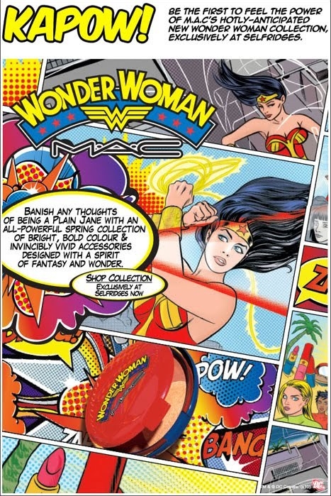
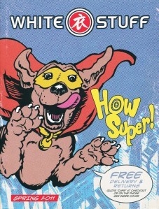
Zap! Voosh! Kerpow! You wait for ages, and then two come along at once. It’s quite uncanny... on the very same day, I get an email from Selfridges touting MAC's new range of ‘Wonder Woman’ cosmetics, and the White Stuff catalogue featuring a super hero dog on the front cover. Both have that familiar retro comic book styling, with the flat blocks of primary colour, exaggerated perspective, visible halftone dots, yellow headlines, and angled caps in speech bubbles. Selfridges, of course, is the real McCoy, with an official DC Comics trademark acknowledgement in the bottom right-hand corner. White Stuff is more of a jokey homage (although Superman did have a canine sidekick called Krypto).
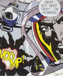
There’s nothing new about it, of course. It’s been appropriated and recycled since 1960s pop artist Roy Lichtenstein (bottom) built his career around it, and has enjoyed countless resurrections, revivals, plunderings and parodies ever since. So the more interesting question is why have two such different brands chosen this moment in time to follow a similar route?
I don’t particularly have an answer. It’s just curious how often this happens. There’s usually something in the creative air which leads designers in the same direction at the same time, even if they’re working in completely different parts of the country. Last year the big thing was bold mono printing on grainy recycled stock, this year designers have gone more delicate and decorative. Until Super Dog came along.
Prepare to be Marvelled.


