new work — Devonshire Square, positioning and website.
Over the past 18 months or so, we’ve been working extensively with branding consultancy Bostock & Pollitt, mainly on (London) property projects. Their particular strength is unearthing something unique about a given development, and then bringing this to life through their branding ideas. We’ve been helping out by expressing B&P’s creative theme in words, naming, straplines, developing an appropriate tone of voice, and then creating copy for digital and printed collateral.
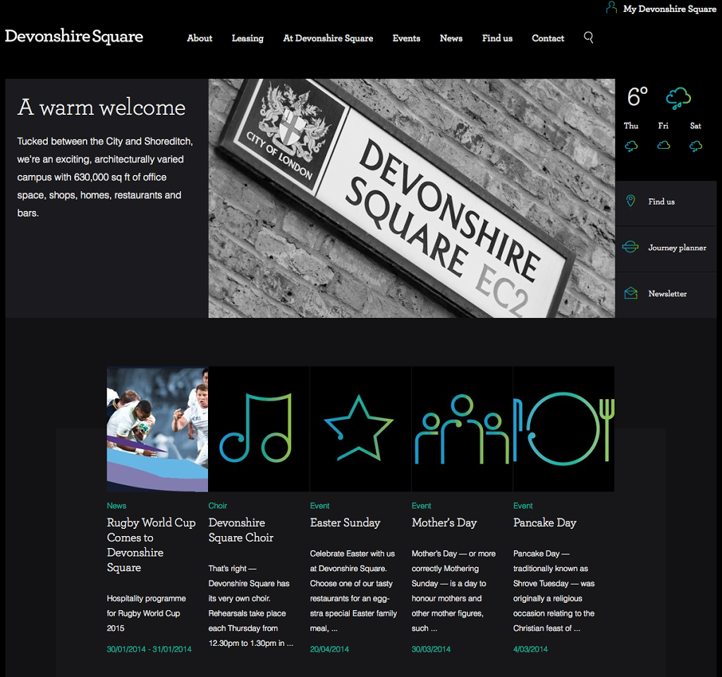
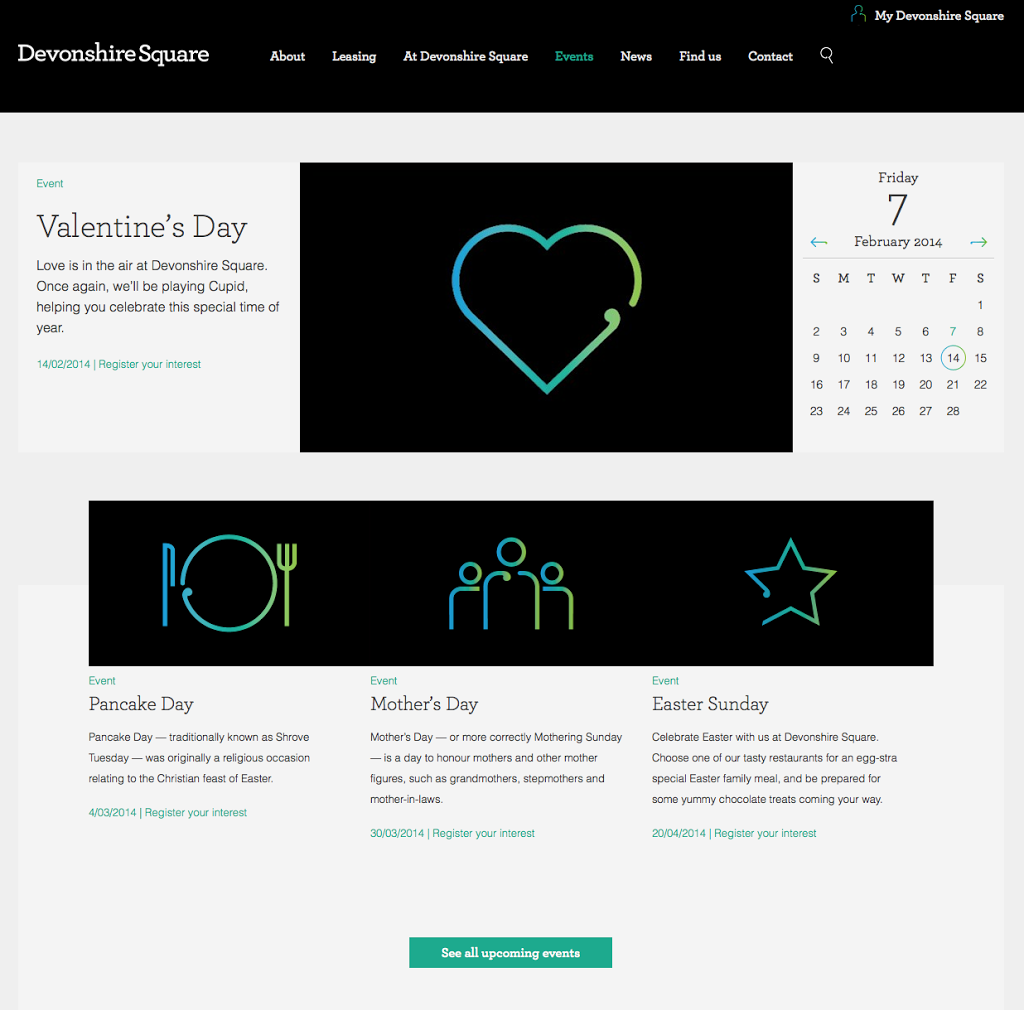
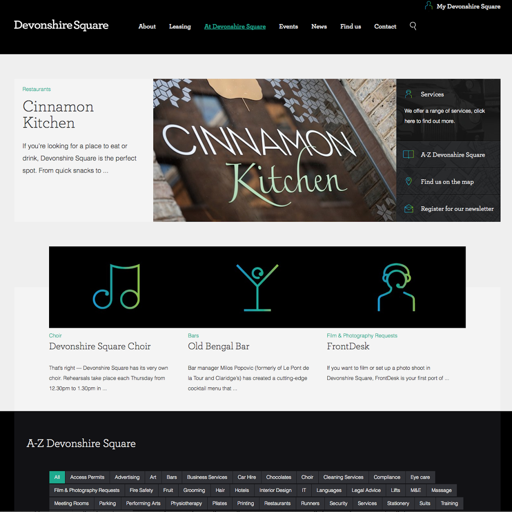
One of these projects was Devonshire Square, an architecturally diverse campus with 630,000 sq ft of office space, shops, homes, restaurants and bars, tucked between the City and Shoreditch.It’s an interesting, buzzy place, with it’s own particular atmosphere — neither City suited nor East London hipsterish, somewhere in between. The stars of the show are undoubtedly an ‘aroma’ of converted original East India Company spice warehouses, as well as a large, spectacular covered courtyard, where all kinds of events and recitals are held.We helped come up with the strapline ‘Different as usual’, and worked on the of the main sections of the website, trying to reflect the energy and character of the place and to bring some cohesion to the many disparate elements that make up the Devonshire Square community. One of the ideas behind the website is that it is constantly changing — like Devonshire Square itself.


