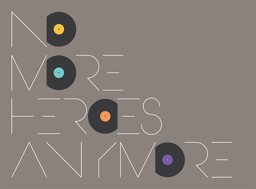
no more heroes anymore.
It would be impossible to put a figure on how many people ended up in graphic design through a love of music. For many, the old 12-inch LP represented a first glimpse of the creative possibilities of the medium.
Originally published on wedesignforum.co.uk on 29 January 2016
As the needle tickled the vinyl grooves, you could lose yourself in the eerie landscape of a Roger Dean/Hipgnosis sleeve. Savour the immaculate impenetrability of Peter Saville’s artwork for Factory Records. Revel in the ornate, gothic canvasses of 4AD’s Vaughan Oliver. Or admire the wanton brutalism of Jamie Reid’s work for the Sex Pistols.
These designers for music enjoyed a certain reflected glamour. Darlings of a burgeoning design press, they straddled the thin line between art and graphics. Most were larger-than-life characters, fascinating and contrary apologists for an industry that was just starting to find its identity. They were known and admired, heroes for young, music-obsessed design students. If you couldn’t master a guitar lick, well, maybe you could have a decent crack at a gatefold cover.
Today, sleeve artwork has been reduced to a stamp-sized .jpg file on a mobile phone. Music, like all media, is instant, disposable and over-abundant. Yes, choice is supposed to be a good thing. But in this click-to-the-next culture, no one bothers to listen to the ‘difficult’ track any more, because there’s always another, more amenable one in the wings. So everything is easy and by numbers. Depth, soul and meaning are anathema.
All of which makes the packaging (if you can still call it that) about as relevant as sticker on a banana. Who created it anyway? Who knows? Without a sleeve or CD cover, credits have to be searched for. And who’s going to be bothered with that?
While design is well represented online, it’s become highly fragmented and often specialist. The printed design press of yore may have been exasperating at times, but at least it provided a focus and forum for what was going on, promoting the movers and shakers of the day, and championing emerging new talent.
The mavericks of music design have been replaced by the bland brand merchants of today. Graphic design is all about guidelines and exclusion zones, rules and regs for the on-message brigade. Much like the LP, it seems that graphics has had the life kicked out of it. So where are today’s heroes, the rule breakers and game changers to lure the next generation of dangerous minds? Not in the large, fat-cat corporate identity consultancies, I’d wager.
Curiously, the most vibrant and creative sector of graphics at the moment is print editorial. Over the past few years, a succession of independent niche magazines have emerged that are brave, brilliant and exciting. Titles like Gym Class, The Gourmand, Delayed Gratification, Anorak, Noble Rot are published for love, not money, and it shows. While in the book world, Unit Editions has set the bar extremely high with its lavish, limited-edition design portfolio.
And there’s hope for the LP yet. In 2014, vinyl sales hit £20 million up from just £3 million five years ago, and the healthiest they’ve been since 1996. That’s mainly due to the unlikely bedfellows of Arctic Monkeys and Pink Floyd (with sleeve designed by Matthew Cooper and Ahmed Emad Eldin respectively). It’s a flicker. But you know what they say about a flicker … it soon ends up as a flame.
