on top of the word.
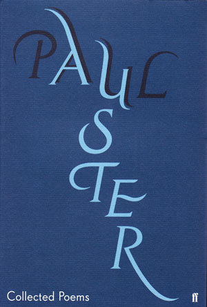
I’ve got out of the habit of reading much poetry recently, but I’m having a bit of a Jenny Grigg’s lettering hints at the process of writing, yet avoids the more flowery excesses of some calligraphy. And the way she’s subtly woven the ‘A’ and ‘U’ of Paul and Auster suggest some of the structural gymnastics that the author is known for. The design, printed on nice quality craft paper, is deceptively simple, but still manages to convey an understated elegance and graphic wit. Right, better read some now... you know what they say about books and covers.