Orrell Consulting — simply does it.
Management consultants aren’t generally known for their straight talking. In fact, the profession is among the most jargon heavy around, on fire with buzzwords, catchphrases and arcane terminology.
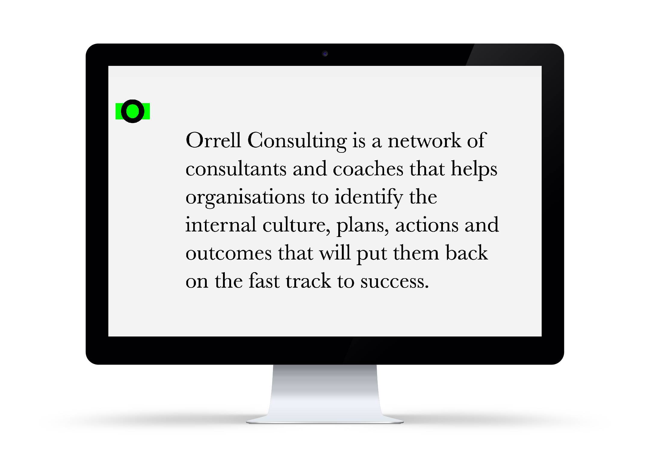
So when Felt Branding commissioned us to help out with the words for James Orrell Consulting’s website, it came as something of a relief that they wanted to buck the trend.
In fact, the whole the premise of the rebrand was keeping things simple and direct. It uses the conceit of a green highlighter, picking out the salient words to get points across with punch and purpose.
The logo is a simple, perfectly round black O struck through with a solid green line. This idea carries on to the main ‘About Us’ text and other written elements, where selected words are overscored with an animated fluoro green highlight.
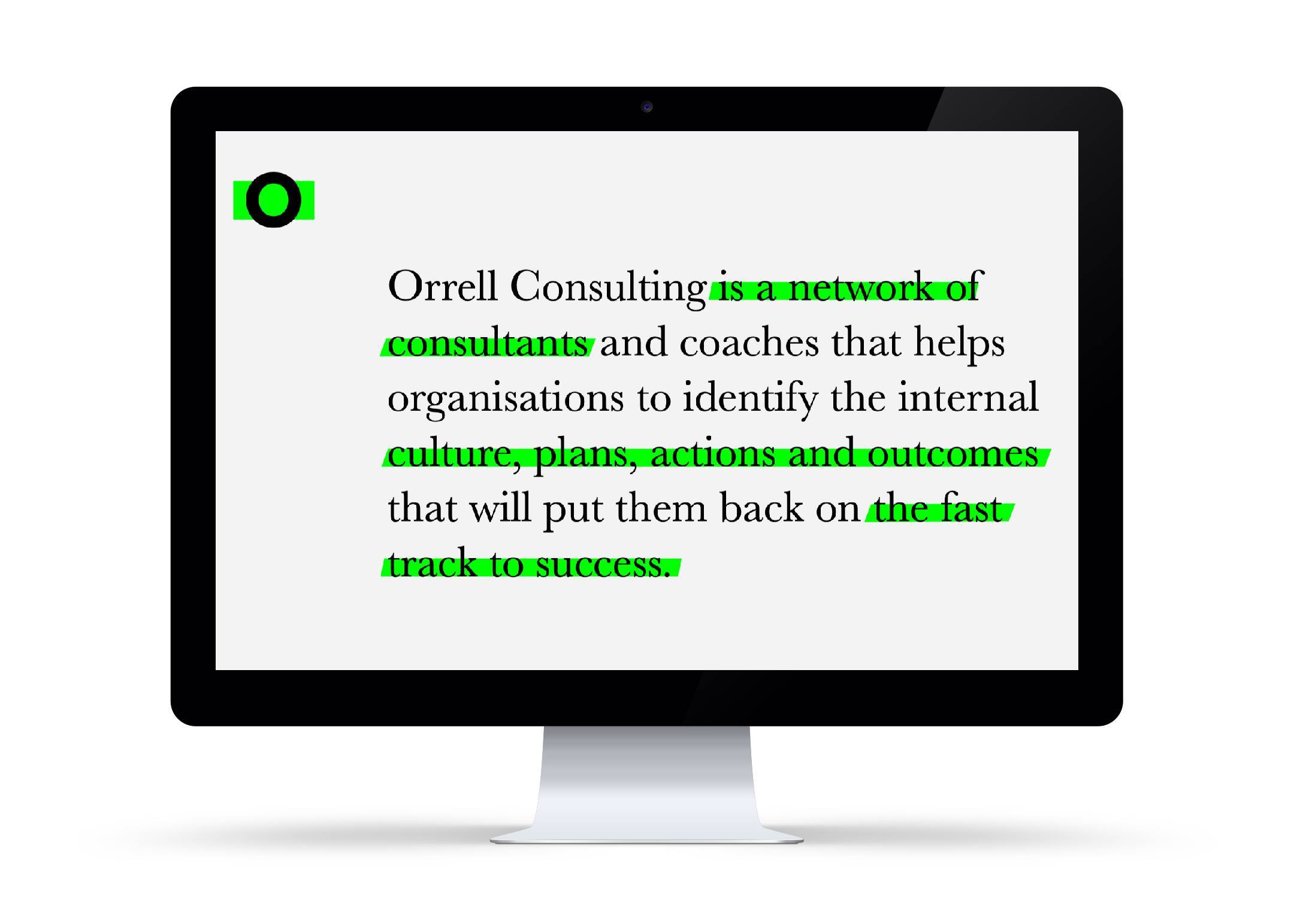
In effect, this involved writing two concurrent About Us’s — a full one and a truncated, notational one — that were able to be read logically at the same time. There was some discussion as to whether the highlighted text might work in full sentences, but this was soon dropped as the main text became too convoluted as a result.
The project was one of the smoothest we’ve worked on. A simple pleasure, you might say. There’s a taster video below, or you can see the full animated website in all its glory here.