our new quotable typographic stationery.
Yep, we’ve moved. After 19 years living and working in a draughty 17th-century Abbey in the middle of nowhere, we’re townies again, and are settling nicely into our new home/studio in Leamington Spa.
New address, new stationery. We were delighted that our friends at Supple Studio decided to take up the challenge. And no mean one. The previous set, designed by NB back in 2007 had cleaned up, winning awards at Design Week, Tokyo Type Designers, and many more.
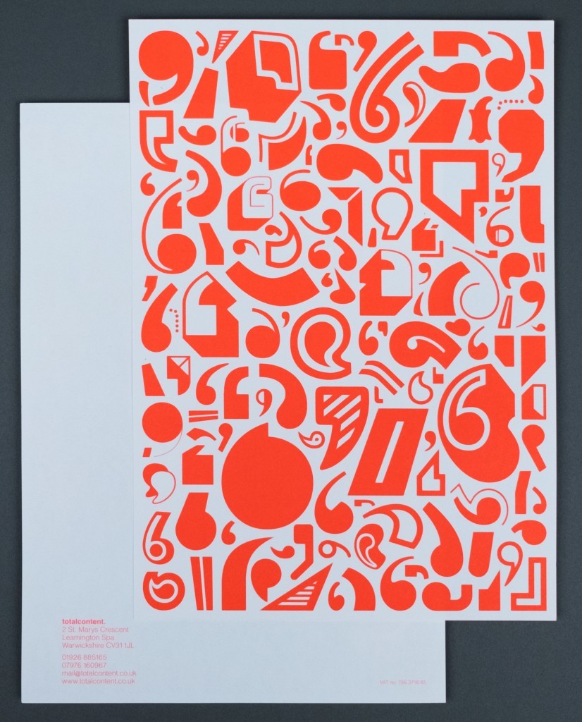
Supple were sensible enough not to throw the baby out with the bathwater. Instead, they riffed on the NB work, with an idea based around a collage of quote marks, signifying the dialogue between words and design. And the seemingly infinite variety of styles they chose — from classics to more outré fonts — suggests the broad spread of work we do, writing in many different voices for different clients.
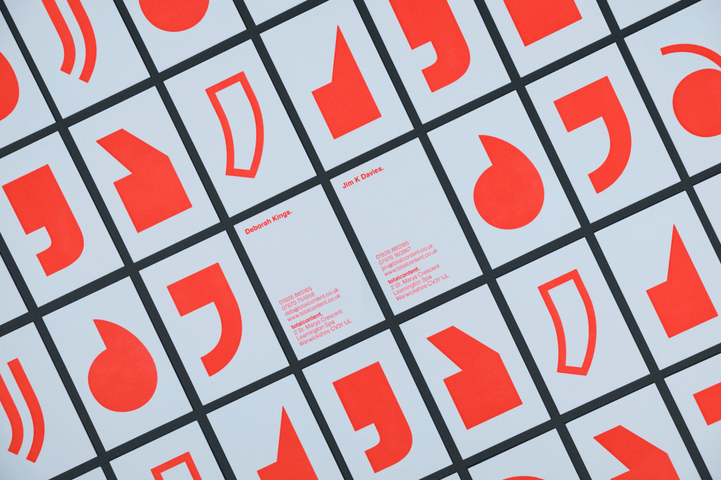
On the back of the letterpress business cards, there are eight different quote marks that can double up as a j or a d (for Jim or Deborah, as appropriate). The stationery is all printed in the same unapologetic fluoro orange as before (Pantone 805U, in case you’re interested).

We’re loving our new look … and sure we’ll love it just as much in ten years’ time.