play your cards right.
Came across this quite brilliant pack of typographic playing cards the other week. They’re the work of Jim Sutherland at hat-trick design, who I’m lucky enough to be working with on the 2010 Royal Mail Yearbook.
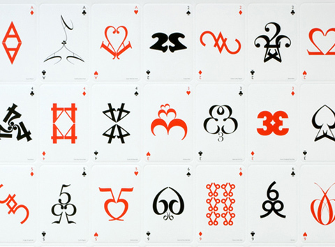
Though they’re being used as piece of self-promotion for the consultancy, they’re actually an immaculately realized piece of personal work. The handling of the type is really witty and elegant, with negative and positive space used to act out suits, royals and numbers. Away from commercial and brand imperatives, the cards eloquently show a true love of type and pure graphics. Can’t wait to get my hands on a pack. There’s a YouTube clip here where you can see all 54 of them in action.