poster post – a word about the 26 words project.
It’s been a while since I took part in a collaborative project with 26, the writer’s group I co-founded with seven others ten years ago. ‘26 Words’, was a kind of reprise of ‘26 Posters’, one of our very first efforts, which randomly paired writers with designers, gave them a letter of the alphabet and asked them to go off and produce a poster together. Back then I got editorial design legend Derek Birdsall and the letter I. Both wonderful.
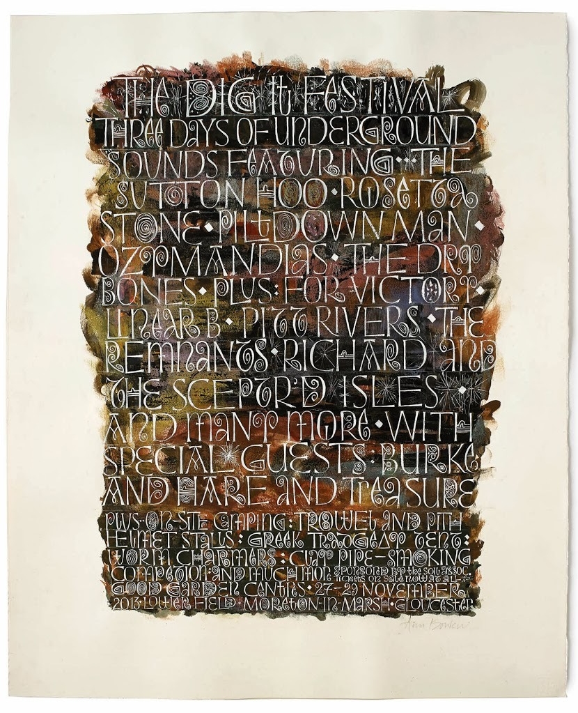
To the letter... publicity poster for the fictitious 'Dig It Festival', calligraphy by Ann Bowen[/caption]This time round 26 writers were paired with 26 lettering artists from the crafts-based lettering association Letter Exchange. I was teamed with the hugely talented calligrapher Ann Bowen and given the letter D, but there was also a twist this time. In a slightly shamanistic ceremony held in the basement of the Betsy Trotwood pub in Clerkenwell, we were asked to stick a knife into a dictionary to pick out a word starting with our given letter. In our case, the tip of knife pointed to ‘dig’.
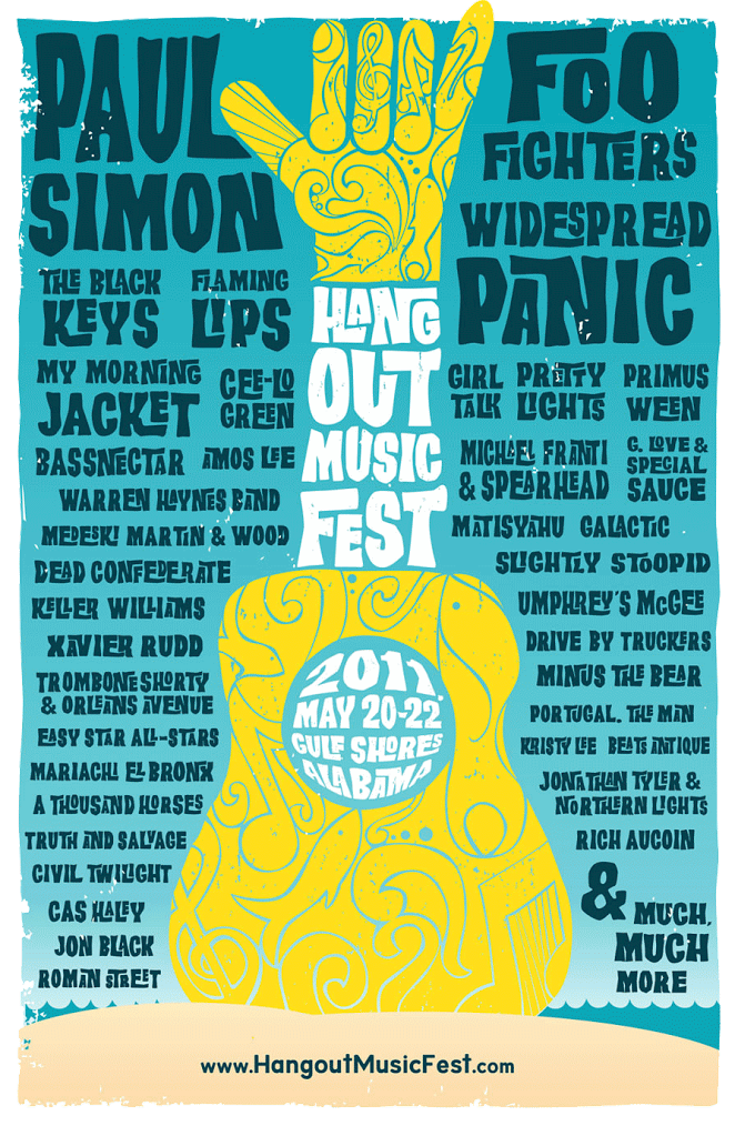
Hang five... poster for Alabama's 'Hang Out Music Festival'[/caption]After a period of getting to know each other and swapping ideas, we finally settled on creating a poster for the fictitious ‘Dig It Festival — three days of underground sounds’. This combined ‘dig’ as a piece of hippie vernacular and the language around famous archaeological digs. There was a pleasing resonance between the esoteric names of digs and band names: The Sutton Hoo, a Mod outfit from the home counties; Rosetta Stone, a blues-influenced hard rock band with lashings of harmonica; Ozymandias, prog rockers with a penchant for ten-minute synth solos; The Remnants, purveyors of no-nonsense, three-chord Punk; Treasure, a willowy Sixties throwback with a haunting voice; Burke & Hare, a prodigiously bearded alt-folk duo; Linear B, an up-and-coming dabbler in soul/rap crossover; and, as they say, many more.The idea lent itself to humour and wordplay, so the writing process was very enjoyable. Festival posters are an interesting and established graphic genre, with a hierarchy that tends to start with the big headliners at the top, and a gradually diminishing typesize for the lesser-known acts below. They are packed with disparate words, giving the impression that there’s loads going on. But the styles are really varied, from lavish psychedelic offerings, to more restrained exercises in typography. Ann went for an expressive, beautifully detailed lettering, with white characters jumping out of a dark earthy background of brown, greens and golds. So as well as a personal take on the festival poster genre, there was a clever visual around digging.So much for our contribution… the ‘26 Words’ exhibition as a whole was fascinating, with really diverse styles and subject matter. Several dramatic 3D stone carvings stood out, but there were also many strong graphic pieces, which really highlighted the quality of the words. All in all, a rip-roaring success, I’d say.‘26 Words’ runs until 31 January at the Free Word Centre, 60 Farringdon Road, London EC1. Then it’s going on tour to Reading, Sunderland and Bruges.

