three to watch.
The Design Museum this week announced its longlist for ‘Designs of the Year’. Maybe their description of these awards as the ‘Oscars of the design world’ is pushing it, but the five-year old-scheme comes with enough glitter and gravitas to mean people sit up and take notice.
There are a couple of things that set ‘Designs of the Year’apart.Firstly, you can’t enter work… you have to be chosen by a panel of experts. The names of these wise heads haven’t been revealed yet, but they are usually desperately starry types from different corners of the design universe (and last year, Will Self). The nominations are, as usual, mind-blowingly diverse — from Hopkins Architects’ 2012 Olympic Velodrome, to the BBC website’s latest home page, to the Duchess of Cambridge’s McQueen wedding dress.Next, it’s really international — buildings in Haiti, Japanese fashion, German furniture, US magazines. Last year’s winner was Samuel Wilkinson’s sculptural Plumen Lightbulb 001, dubbed ‘the world’s first designer eco-bulb’. In 2009, Sheperd Fairey’s ‘Hope’ Barack Obama poster got the vote.Finally, ‘Designs of the Year’ has its own six-month long exhibition at the Design Museum, running from 8 February to 15 July. Now that’s what you call exposure.So it was with some delight that I found out that three designs close to my heart have made it on to the longlist. Here’s my totally biased opinion, and part in their success (just kidding).
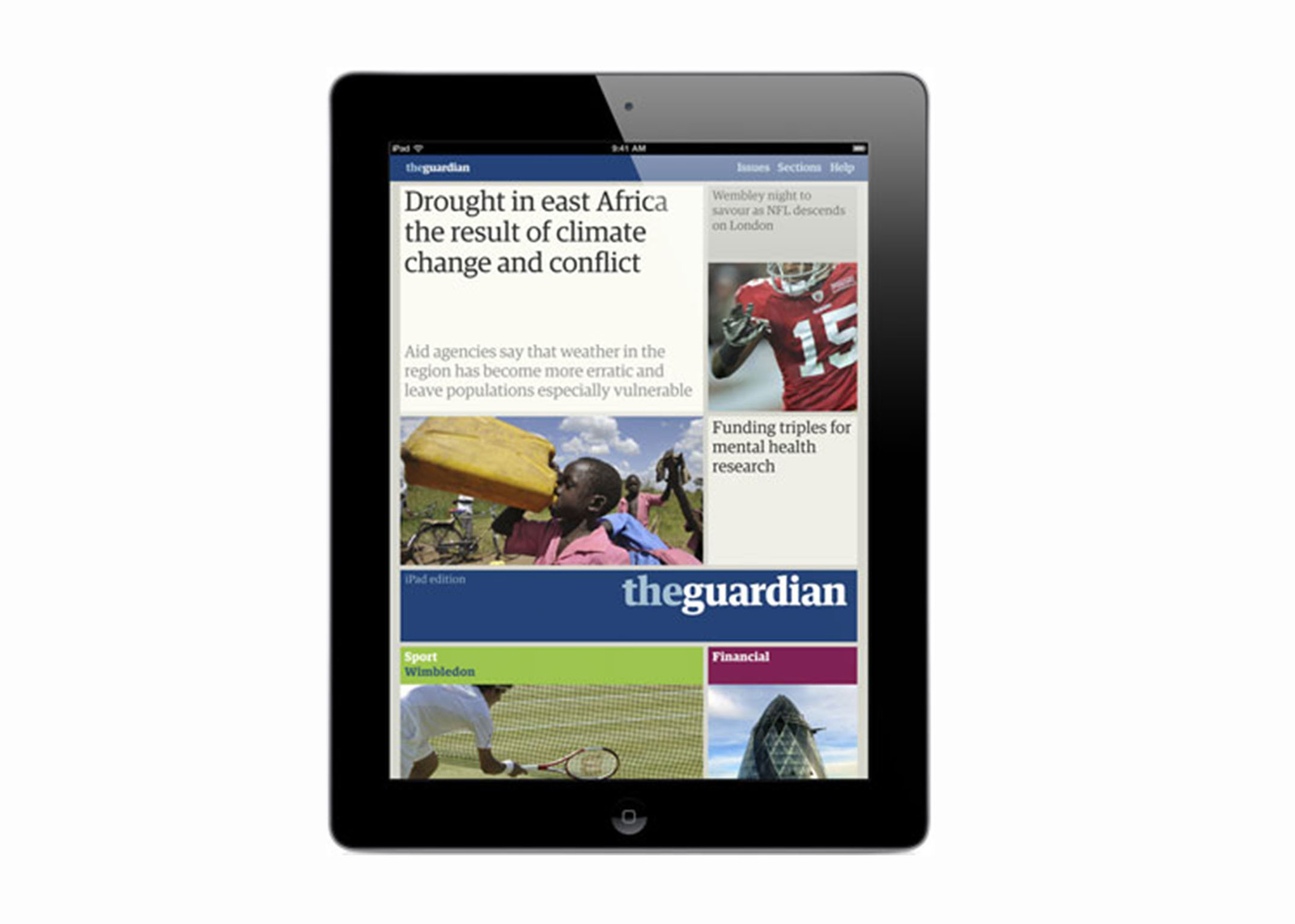
1 Mark Porter’s iPad app for the Guardian.
Impeccably considered, and downloaded nearly 150,000 times in its first week of release, this sets a new standard in ‘newspaper’ apps. Mark is an old mate of mine — I worked with him many years ago on a design and advertising magazine called Direction, where he was art director. He then went on to greater things, most notably becoming CD of the Guardian and overseeing its redesign to Berliner format in 2005. More recently, I helped craft some words for Mark Porter Associates’ website, which are going live soon.
Above: Apps off... digging Mark Porter’s digital design
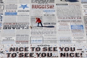
2 Why Not Associates’ Comedy Carpet in Blackpool. A collaboration with artist Gordon Young, this beauty was five years in the making and lies in the shadow of the famous Blackpool Tower. It is an exquisitely realized, 1880-square-metre typographic compendium of jokes and catchphrases, cut from solid granite or cobalt blue concrete, arranged into over 300 slabs and then cast into concrete. Lovingly set in the style of a traditional music-hall style playbill, the ‘Comedy Carpet’ is an example of accessible graphic design at its very best. It’s already (and deservedly) picked up the Grand Prix at the prestigious Tokyo Art Directors Club. I’ve known Andy Altmann and David Ellis who founded WNA for over 20 years, and collaborate with them fairly regularly (though unfortunately not on this one).
Above: Cutting a rug... Why Not Associates and artist Gordon Young have a laugh in Blackpool
3 Nokia Pure typeface by Dalton MaagNokia is my main client at the moment, so I’ve been working closely with this font for six months now. I interviewed typographer Bruno Maag about the design process for Uusi, the Nokia brand magazine, so I’m fully aware of the effort and rationale behind it. At first I thought it might be a bit safe, but now I’m starting to see little quirks and subtleties that I hadn’t noticed before. It’s definitely grown on me.
Above: It’s a Maag world... purity of idea and execution
I wish everyone good luck on 24 April when the winners are announced. But especially these three.


