ticking all the boxes.
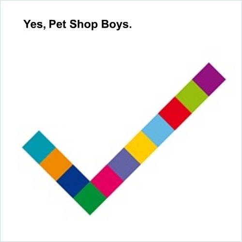
Big thumbs up (or should that be tick?) for big Pet Shop Boys. Mark has been designing PSB’s sleeves for over 20 years to a consistently wonderful standard. His great talent is that he always knows when to stop. The irresistible cover artwork for ‘Yes’ reflects the pop sensibility of the new CD, and was influenced by the 4900 exhibition at the Serpentine Gallery, which featured panels of brightly coloured squares. The central tick image is made up of eleven differently coloured squares, one for each track on the album.
Now the burning question is, would this have been better without the title and artist top left, or would that just have been gratuitous?
