word of the week – 'flip-top’ (flɪ́p-tɑ́p).
Just been doing some research into the semiotics and visual language of packaging for a piece I’m writing for Uusi, the Nokia brand magazine. In the course of this rooting around, I came across some interesting stuff about Marlboro cigarettes.
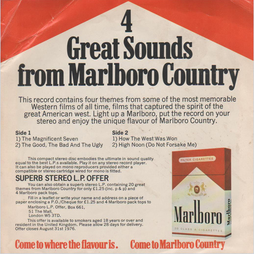
Firstly, that these macho tabs were originally marketed at women —back in the 1950s, real men scoffed (or coughed) at filters. They came in a soft, white packet, covered in a foil wrapper with lots of feminine script lettering.The brand was utterly transformed in 1955, when a designer called Frank Gianninoto came up with a design that had to look good on black-and-white television. The white arrow jutting into the red space at the top was simple, bold and graphic, and seemingly never went out of fashion. But it was the new-fangled flip-top box that broke the mould, contributing to the brand’s built-for-the-tough outdoors image. It became an enduring symbol of Americana, and only 20 years ago was pronounced the most valuable brand in the world. But who’d have thought that the Marlboro man had had a sex change? In his book ‘The Total Package’, Thomas Hine notes: “Everybody knows, intellectually at least, that great packages don’t always hold good things. But that is a truth that the best packages try to make people forget.”
