word of the week – ‘score’ (skɔː).
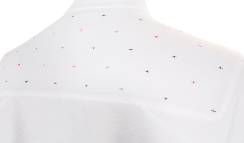
From Mark Farrow to Peter Saville, two designers from the same Factory. In the light of this week’s shenanigans at the FA, I though it would be worth revisting Saville’s recent redesign of the England football shirt. If you recall, the former Creative Director of the City of Manchester took the bold step of introducing some colour to the national team’s traditionally pristine white kit.
Right across the back and shoulders, there are a series of teeny stitched crosses, in red, blue and green (colours which already feature on the three lions crest), plus a blend of all three, which arrives at purple. They reference the George Cross, of course, but also gently subvert it, alluding to the fact that England is now a multi-cultural country.Given the underlying rumpus that led to Fabio Capello’s resignation, and the current clamour for an English manager, you might think there’s a certain irony in the idealism of Saville’s design. But I’d suggest the designer fully knew the score when he conceived his idea, and in some ways, recent events have conspired to make it even more relevant. Once again, he’s managed to be subtle yet controversial, in details as devilish as ever.
Above: By St George... I think he’s got it
Here’s how Saville explained his rationale to Creative Review at the time of the shirt’s launch: “It’s beautiful but it’s very loaded. I was frustrated, along with many others, by the marginalisation of the cross of St George. It has acquired connotations that some of us don't associate with and I find that frustrating because there is nothing wrong with it as a symbol. [The design] is a provocation. It’s not negative, it’s not aggressive, it’s not critical and I think it feels like England 2010. This is a country of lots of different people, get on with it.” Hear, hear.
